Telling the Story: Eight Great Infographics on Climate Change
The big picture: Our brains love images. They’re just hard-wired that way. Some numbers to make the point concrete:- Almost 50 percent of your brain is involved in visual processing. Looks aren’t everything of course – but they’re a lot.
- Seventy percent of all sensory receptors are in your eyes.
- One-tenth of a second is all it takes to understand a visual scene.
The (pretty) big solution: Infographics. Infographics can take a lot of different forms, but at the core, they take a message and play to the visual parts of our brains by illustrating the message in a way that makes it more accessible, persuasive, and engaging than text alone. So for the sake of your brain, we wracked ours for some of the best infographics we’ve seen on climate change.

Climate Reality: Ten Indicators of a Warming World
Before you accuse us of being too conceited, this is actually an adaptation of a great infographic by NOAA (hey, we believe in giving credit where it’s due). This one is also a natural place to start if you’re trying to understand climate change from the bottom up. It’s simple: the climate is already changing and this is how we can tell. We recently published a blog on the subject that goes into greater detail, but the visual is a great crash courseWorld Bank: Climate Extremes, Regional Impacts, and the Case for Resilience
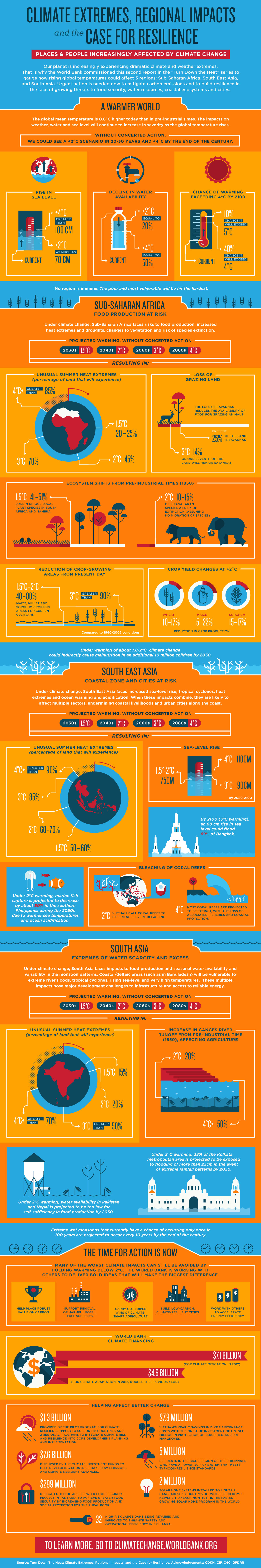
Now, we know that climate change is already happening. But what’s going to happen if we don’t act? A good infographic, like a good story, has a beginning, a middle, and an end. This
visual by the World Bank sets the scene by breaking down the global
effects of climate change if humans fail to take action: rising global
sea levels, declining drinking water, and increasing global
temperatures. Then, it gets into the meat of things: a few case studies
on the impact of climate change in specific regions over time.
This
visual by the World Bank sets the scene by breaking down the global
effects of climate change if humans fail to take action: rising global
sea levels, declining drinking water, and increasing global
temperatures. Then, it gets into the meat of things: a few case studies
on the impact of climate change in specific regions over time.
But everyone loves a happy ending. We’re not doomed yet! The story concludes on a note of climate hope: we can avoid the worst impacts of climate change by putting a price on carbon pollution, ending fossil fuel subsidies, and building resilient cities.
CGIAR: Climate Impact on People 
When it comes to climate change, the devil is in the details. It can be
hard to strike the right balance between too much and not enough
information in an infographic. Too much, people lose interest. Not
enough, it fails to inform. This infographic achieves the impossible by
being at once succinct and detailed. On the outside, it may seem pretty
straightforward in illustrating the links between climate change and our
everyday lives: where we live, how we eat, and what weather we
experience. Click on the tiles, though, and CGIAR gets down to the
nitty-gritty: a list of additional facts, further reading, and sources.
Climate Reality Australia: A Brief History of UNFCCC COP Meetings

The first three infographics on this list show that climate change is happening and how. So what have world leaders been doing about it? And what do all those acronyms in international climate politics actually stand for?
Climate Reality Australia distills 25 years of some of the most noteworthy UN climate summits – each one formally known as a “Conference of the Parties” or “COP” – into a clear timeline that tells the story of global efforts to limit greenhouse gas emissions. It’s a story worth knowing because, as the line goes, “Those who cannot remember the past are doomed to repeat it.” It may not be the Cadillac of all infographics, but sometimes simple just works best.
The Solutions Project: 50 States/50 Plans

Alright, we’ve covered the past – let’s move on to the future. We’re cheating a little here because The Solutions Project has actually put together 50 top-notch infographics on what might seem impossible: how all 50 of the United States can be 100-percent powered by renewables by 2050. Each state’s infographic has a story that’s easy to follow, starting with an envisioned 2050 energy mix free of fossil fuels. What’s really compelling, though, is how The Solutions Project succinctly breaks down the benefits of moving to an economy without GHG emissions: greater energy efficiency, avoided mortality and illness, and money in your pocket. It’s hard to argue with climate solutions when someone hands you a blueprint on how to make it happen – and a long list of benefits to boot.
Save On Energy: How Wind Turbines Work
 Here
at Climate Reality, we’re big fans of wind energy. But when we saw this
infographic, it really blew us away. The only animated entry on this
list, it goes behind the scenes of wind energy generation to break down
the job of each piece of a turbine (from the blades to the yaw drive).
Then Save on Energy steps back to look at the big picture, laying out
the history of wind turbines, wind employment, and the process of wind
farming.
Here
at Climate Reality, we’re big fans of wind energy. But when we saw this
infographic, it really blew us away. The only animated entry on this
list, it goes behind the scenes of wind energy generation to break down
the job of each piece of a turbine (from the blades to the yaw drive).
Then Save on Energy steps back to look at the big picture, laying out
the history of wind turbines, wind employment, and the process of wind
farming.
Climate Reality: Water-Energy Nexus

Most people know that using fossil fuels drive climate change, which could have serious consequences for our water supply. But not everyone knows that using fossil fuels also impacts our water supply much more directly. Namely, by using exponentially more water to generate electricity than many renewables do. This is another good example of an infographic that takes a big, wonky idea like the “water-energy nexus” and makes it immediately accessible and easy to understand.
PopSci: Scientists Who Doubt Human-Caused Climate Change

“The next time you hear someone dispute that human activity is destabilizing our climate, remember this pie chart.” All of these infographics together tell one story: climate change is real, it’s happening, and we can create a better future with clean energy. But this representation of a survey of over 2,200 peer-reviewed scientific articles on climate change published from November 12, 2012 through December 31, 2013 – which originally ran in Desmog Blog – adds another dimension, exposing the myth of scientific debate on the issue with a single (almost entirely) blue dot.
With this study showing about 99.9% of scientific articles agreeing that climate change is real and caused by human activity, it might be time for the famous “97 percent study” to move over.

No comments:
Post a Comment