Obamanomics explained through pictures
By Rick Manning — They say a picture is worth a thousand words,
these are the easy to understand graphs that Team Obama doesn’t want
people to see, because they speak volumes about his failed economic
policies. Unless otherwise indicated each of the graphs are from the
Labor Department’s Bureau of Labor Statistics.
They show the danger our nation faces due to the employment situation, the financial situation of average American families and the looming national debt disaster, all exacerbated under Obama’s watch.
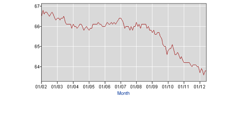
How many working aged Americans are participating in the labor force?
This chart is significant because it indicates the faith that people have that they will be able to find a job.
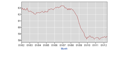
 What percentage of the working age population (16 years of age and older) are employed?
This is significant because the fewer number of people employed as a percentage of the overall working age population, the fewer people paying taxes, and providing the labor to help make our economy thrive.
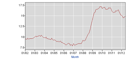
Rate of total unemployed, plus all marginally attached workers and those employed part time for economic reasons
The commonly reported unemployment rate of 8.2 percent is a fraction of those who are in the labor force but are stuck in part time jobs because there are not any full time ones available. The Bureau of Labor Statistics classifies the combination of the fully and part time employed for economic reasons and other workers “marginally attached to the workforce” as the U6 rate. Note this rate does not include those who have left the workforce. In June 2012, there were 14.9 percent of the civilian labor force in this category, or 23.1 million people.
 How many Americans are not in the workforce, but want a job now?
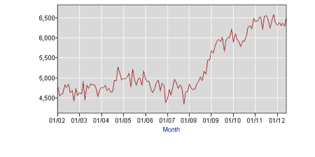 In
June 2012, 6.5 million people were not considered to be in the
workforce, but wanted a job now. These people are not considered either
unemployed or underemployed in the U6 compilation used by BLS.
When combined, you learn that just shy of 30 million working aged Americans want full time jobs but just cannot find them. This brings the true, effective underemployment rate in our country to 19.3 percent of the working aged population.
To put 30 million people into perspective, if every person who wanted a job were living in the same region, it would be the equivalent of everyone in New York, New Jersey and most of Connecticut all wanting full-time jobs but not being able to find one.
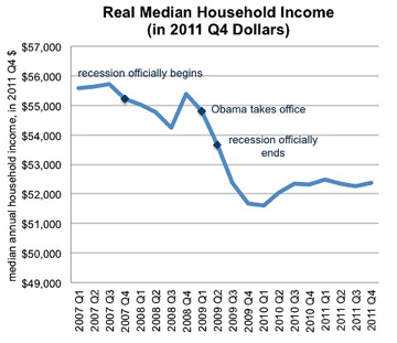
Do Americans have more income today than when Obama took office?
This chart was compiled by Moody’s economist Mark Zandi and printed by the New York Times on July 11, 2012. It speaks for itself.
 What is the net worth of the average American household?
This chart was created by Peter Coy using the latest available Federal Reserve data and was distributed by Reuters on June 12, 2012.
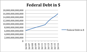
 Is the federal government really spending way more than it takes in each year? Isn’t this just data manipulation?
Here is the data directly from the U.S Department of Treasury’s website detailing the growth or contraction of the national debt on a daily basis.
 What is the real state of the U.S. economy?
Our nation’s national debt has exploded past the total amount of goods and services that our nation produces each year with no signs of slowing down any time soon.
Americans household income has declined precipitously since Obama took office, and not surprisingly the net worth of the average American has plummeted as well.
30 million Americans are either unemployed or underemployed, and a smaller percentage are employed than at any time since 1983.
Looking at the facts of what is really happening in America, it is hard to understand how Obama could say, “The country is headed in the right direction,” just a couple of weeks ago.
Rick Manning is the Communications Director of Americans for Limited Government. You can follow Rick on Twitter at @RManning957.
They show the danger our nation faces due to the employment situation, the financial situation of average American families and the looming national debt disaster, all exacerbated under Obama’s watch.
How many working aged Americans are participating in the labor force?
This chart is significant because it indicates the faith that people have that they will be able to find a job.
Labor Participation Rate
 What percentage of the working age population (16 years of age and older) are employed?
This is significant because the fewer number of people employed as a percentage of the overall working age population, the fewer people paying taxes, and providing the labor to help make our economy thrive.
Employment Population Rate (16 years of age and older)

Rate of total unemployed, plus all marginally attached workers and those employed part time for economic reasons
The commonly reported unemployment rate of 8.2 percent is a fraction of those who are in the labor force but are stuck in part time jobs because there are not any full time ones available. The Bureau of Labor Statistics classifies the combination of the fully and part time employed for economic reasons and other workers “marginally attached to the workforce” as the U6 rate. Note this rate does not include those who have left the workforce. In June 2012, there were 14.9 percent of the civilian labor force in this category, or 23.1 million people.
U6 Underemployment Rate
 How many Americans are not in the workforce, but want a job now?
 In
June 2012, 6.5 million people were not considered to be in the
workforce, but wanted a job now. These people are not considered either
unemployed or underemployed in the U6 compilation used by BLS.
In
June 2012, 6.5 million people were not considered to be in the
workforce, but wanted a job now. These people are not considered either
unemployed or underemployed in the U6 compilation used by BLS.When combined, you learn that just shy of 30 million working aged Americans want full time jobs but just cannot find them. This brings the true, effective underemployment rate in our country to 19.3 percent of the working aged population.
To put 30 million people into perspective, if every person who wanted a job were living in the same region, it would be the equivalent of everyone in New York, New Jersey and most of Connecticut all wanting full-time jobs but not being able to find one.
Do Americans have more income today than when Obama took office?
This chart was compiled by Moody’s economist Mark Zandi and printed by the New York Times on July 11, 2012. It speaks for itself.
 What is the net worth of the average American household?
 This chart was created by Peter Coy using the latest available Federal Reserve data and was distributed by Reuters on June 12, 2012.
 Is the federal government really spending way more than it takes in each year? Isn’t this just data manipulation?
Here is the data directly from the U.S Department of Treasury’s website detailing the growth or contraction of the national debt on a daily basis.
 What is the real state of the U.S. economy?
Our nation’s national debt has exploded past the total amount of goods and services that our nation produces each year with no signs of slowing down any time soon.
Americans household income has declined precipitously since Obama took office, and not surprisingly the net worth of the average American has plummeted as well.
30 million Americans are either unemployed or underemployed, and a smaller percentage are employed than at any time since 1983.
Looking at the facts of what is really happening in America, it is hard to understand how Obama could say, “The country is headed in the right direction,” just a couple of weeks ago.
Rick Manning is the Communications Director of Americans for Limited Government. You can follow Rick on Twitter at @RManning957.
Read more at NetRightDaily.com: http://netrightdaily.com/2012/07/obamanomics-explained-through-pictures/#ixzz2NS3rfPZD

No comments:
Post a Comment